Wolverine Wellness
Description: Wolverine Wellness was a theoretical app created for the purpose of redesign in SI 320, Graphic Design
Duration: 3 Weeks
Toolkit: Adobe Illustrator, Figma
Team: Solo - Graphic Designer/UI Designer
Table of Contents

Research
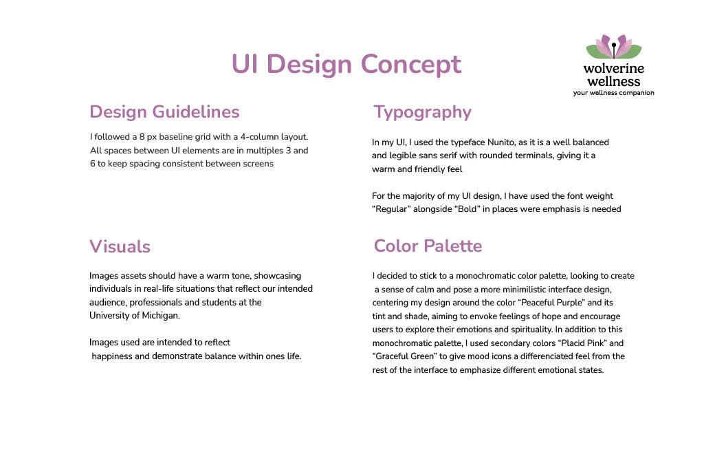
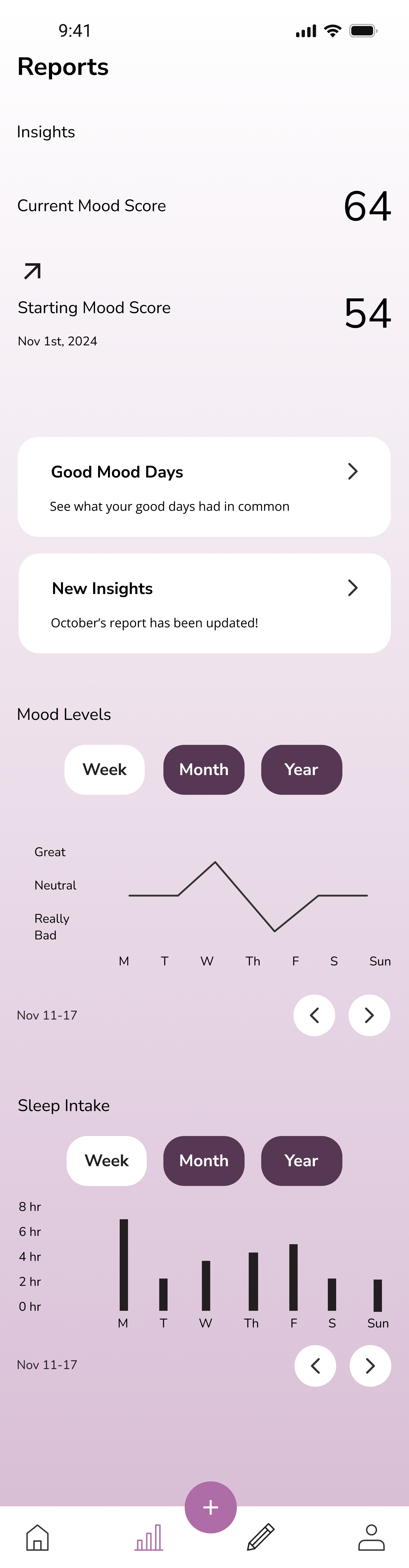
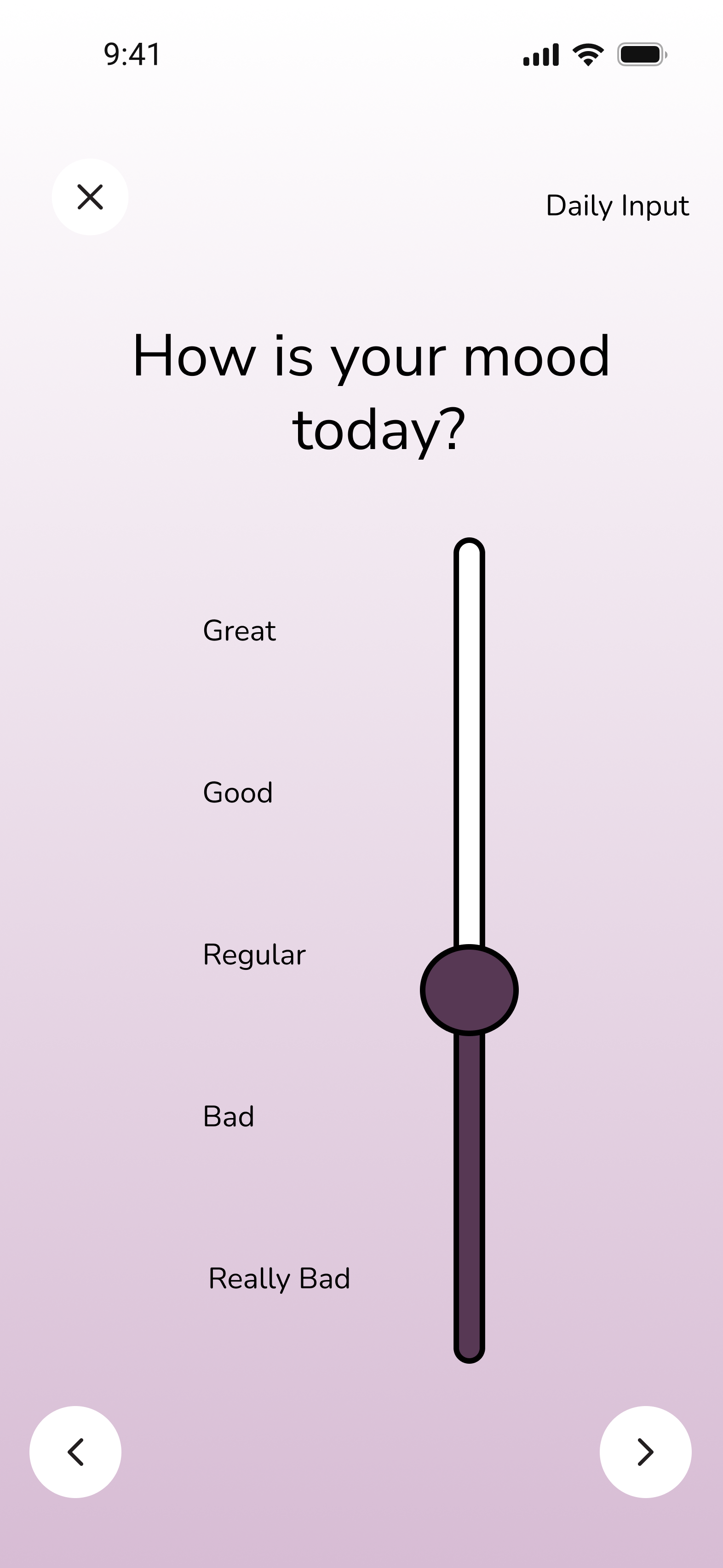
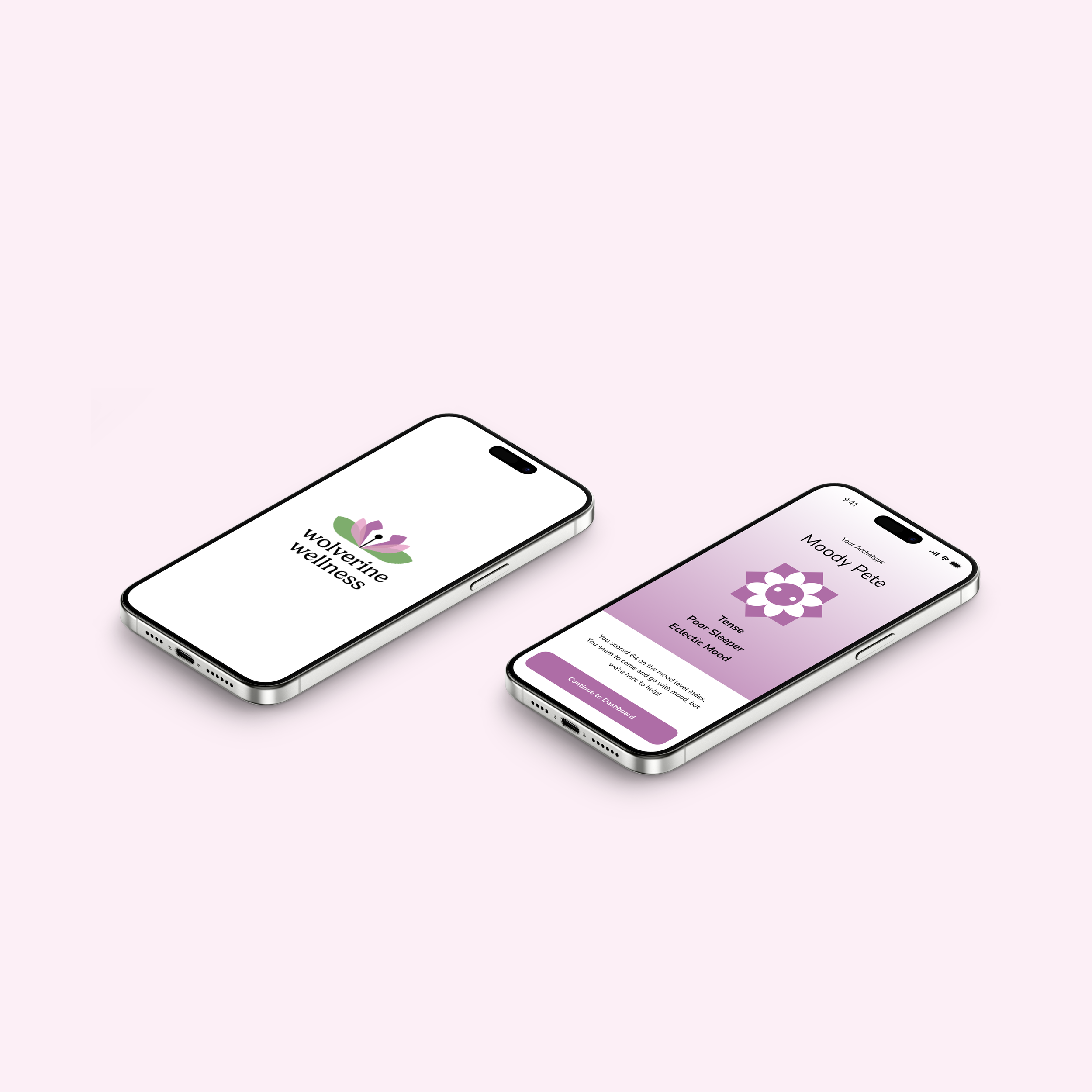
For this project, my client was theoretically the University of Michigan. For this assignment, I was given a client debrief on paper. We were told that we must make a branding guide for an app focused on mental wellbeing for individuals on this campus. This app was a way for individuals to document their feelings and find correlations between their feelings and their schedules.
I then found the university’s existing assets and took the symbolism listed for colors and decided that I would make a logo that used those specific colors. Given that this focuses on mental wellbeing, I utilized the color purple which represents, “Mental well-being. Experiencing and managing a range of stressors, thoughts, and emotions in everyday life” (Model of Wellbeing).
Competitive Analysis
For my research, I conducted a competitive analysis with other applications on the market, taking note of their color symbolism used and the purpose of given apps and the types of graphics used for other wellness applications
MindShift CBT
Competitor Type: Direct
Product/Service: Mood Tracker

Daily Bean
Competitor Type: Indirect
Product/Service: Journal

Daylio
Competitor Type: Indirect
Product/Service: Journal
Key Findings

Moodfit
Competitor Type: Direct
Product/Service: Mood Tracker
Competitors use shades that appear in nature, providing a sense of calm
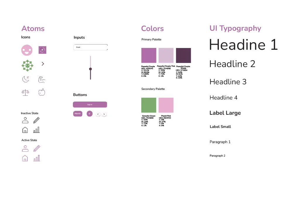
All competitors use caricature icons
3/4 Competitors use fonts with round aspects
Ideation

After looking at the assets of both U-M and the wellbeing collective, I decided to consider what I associated with wellness. The first symbol for wellness that came to mind for me was a lotus. Across many cultures, lotuses are seen as symbols of enlightenment and well-being. Furthermore, given that this app acts as a tracker where one can document their thoughts, I thought it would be a nice touch to utilize the imagery of a traditional pen tip as it is associated with documentation.
This app is supposed to give insight into one’s mental health and emotional well-being. Given that the well-being collective’s wheel has different colors that represent different aspects of wellness, I wanted to highlight purple as it represents mental well-being.
I also went with the name ”wolverine wellness” as I thought it was catchy and associated with U-M and the purpose of the app.
After receiving feedback from my professor, I decided to go with the design on the bottom as it was the most scalable. Furthermore, I decided to use the characture in other aspects of the application instead of as the main logo design.

After my first deliverable (which was a branding guide centralizing the top logo), and spending time in office hours, I was encouraged to further explore gestalt principles for my final branding guide. After spending a few hours on ideation, I decided to utilize the gestalt principle of figure/ground and continuity.