MiMaizey
Description: MiMaizey is a generative Artificial Intelligence (AI) provided by the University of Michigan (U-M) Information Technology Services (ITS) that aims to answer U-M-specific inquiries.
Client: University of Michigan, Information Technology Services
Duration: September 2024 - December 2024
Role: UX Designer, UX Researcher
Toolkit: Figma, FigJam, Pen & Paper
Research
Initial Client Debrief
In an open class discussion, we asked Michael Hess (who was working on the behalf of the University of Michigan’s Information Technology Services (UM ITS)), to tell us a bit about each given tool. From this interview, we learned that UM ITS was open to seeing all different types of designs, and most of all, wanted the U-M Community to use and understand these generative AI tools. At the time, MiMaizey was not something that was in its beta phase. Given the University of Michigan’s specific needs that MiMaizey fulfilled, I was the most drawn to it for redesign.
Competitive Analysis
“I want MiMaizey to be something that students actually use and trust”
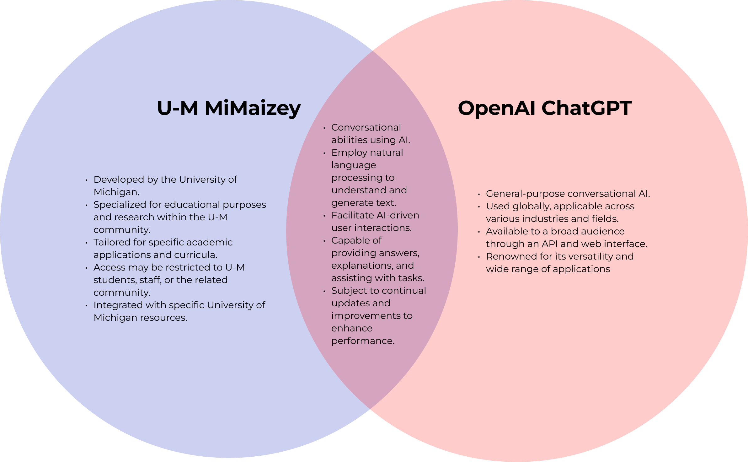
Why choose MiMaizey?
It has the answers to questions that you could not ask dominant players such as OpenAI cannot answer
The Problem
to sum it all up…
MiMaizey's current design lacks user interface features like a history feature and method to communicate data privacy policies efficiently.
As stated by the creator of MiMaizey, Michael Hess, the current design of the generative AI tool
lacks user interface features that would enhance usability such as a history feature and a method to convey its policies regarding data privacy clearly. Furthermore, users are unaware of how MiMaizey currates answers. These deficiencies cause students to prefer other generative AI tools that they find more familiar and trustworthy, leading them to miss out on the tailored experience MiMaizey offers.
Ideation

As a novice designer, I find that it is extremely important to visualize your design on pen and paper before turning to creating a digital mock-up. During this stage, I heavily focused on creating an onboarding experience in order to demystify the workings of MiMaizey, as the pain point of information asymmetry above could be alleviated partially through this, although it has its limitations.
Screen 1
Screen 2
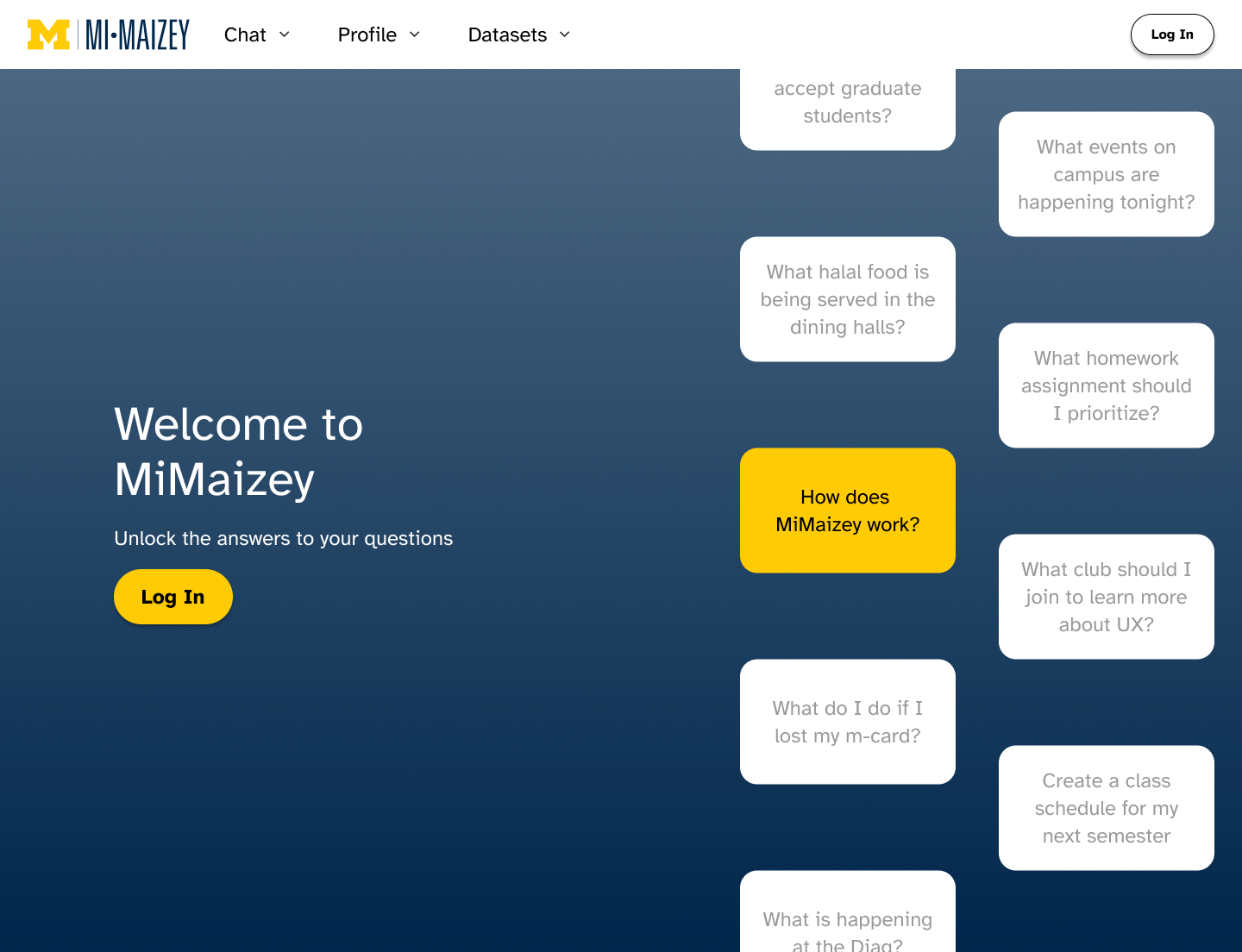
After viewing the largest LLM competitors approach to conveying information, I decided to follow suite as Jakob’s Law indicates that users will anticipate similar websites (or in this case LLMs), to act the same. This decision I anticipate would allow for ease of use.
Screen 3
Screen 4
Low-Fidelity

High-Fidelity
Prototyping


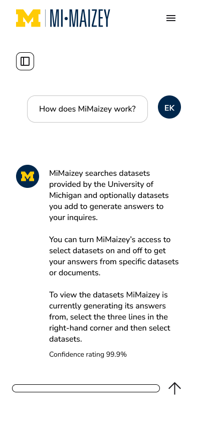
Following a similar philosophy, I decided to use a hamburger navigation button as users expect similar layouts to other websites.

Screen 5
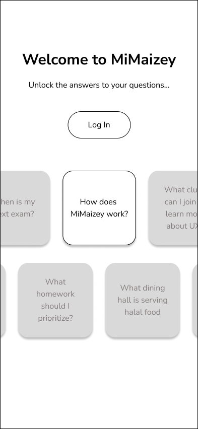
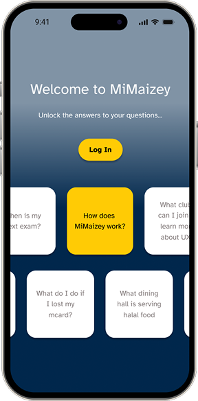
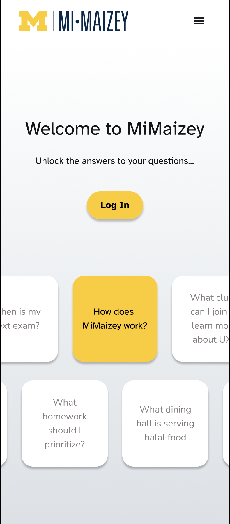
For my first wireframe, I thought that it would be a great idea to display the multiple features/questions that could be answered by MiMaizey and not by other competitors. By having the floating questions one may be more inclined to use MiMaizey.

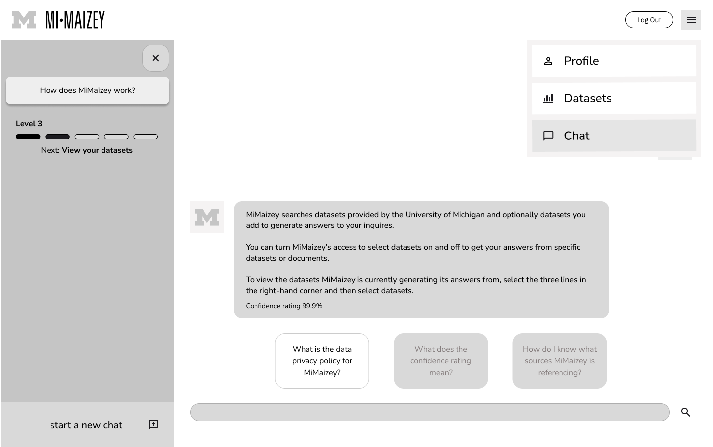

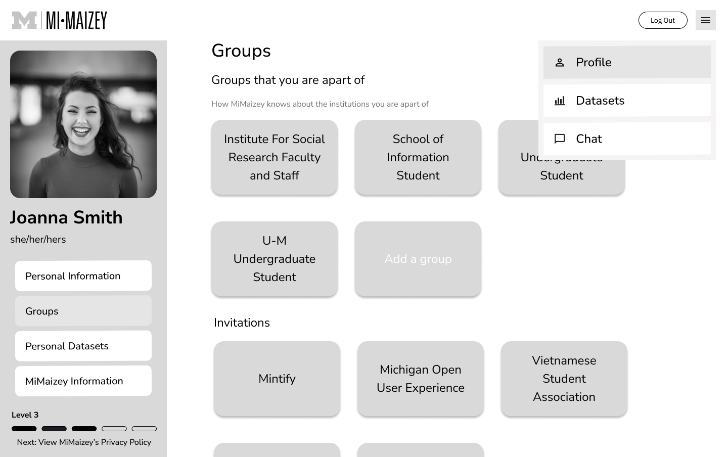
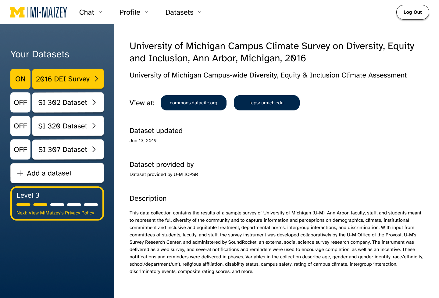
In order to further reduce information asymmetry, I thought that it would be a great idea to give users the ability to control what datasets are used in the formation of MiMaizey’s answers. This gives the user more control over the output.

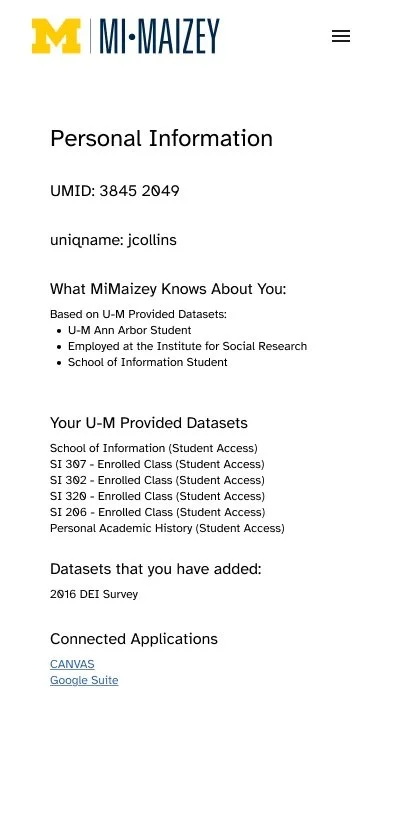
To encourage a feeling of control, users will be able to see what clubs and courses they have taken and what datasets are linked to each program.
Screen 1
Screen 2
Screen 3
Screen 4

Following a similar philosophy, I decided to use a hamburger navigation button as users expect similar layouts to other websites.

Screen 5


In order to further reduce information asymmetry, I thought that it would be a great idea to give users the ability to control what datasets are used in the formation of MiMaizey’s answers. This gives the user more control over the output.
To encourage a feeling of control, users will be able to see what clubs and courses they have taken and what datasets are linked to each program.
Landing Page
Macbook 14” View
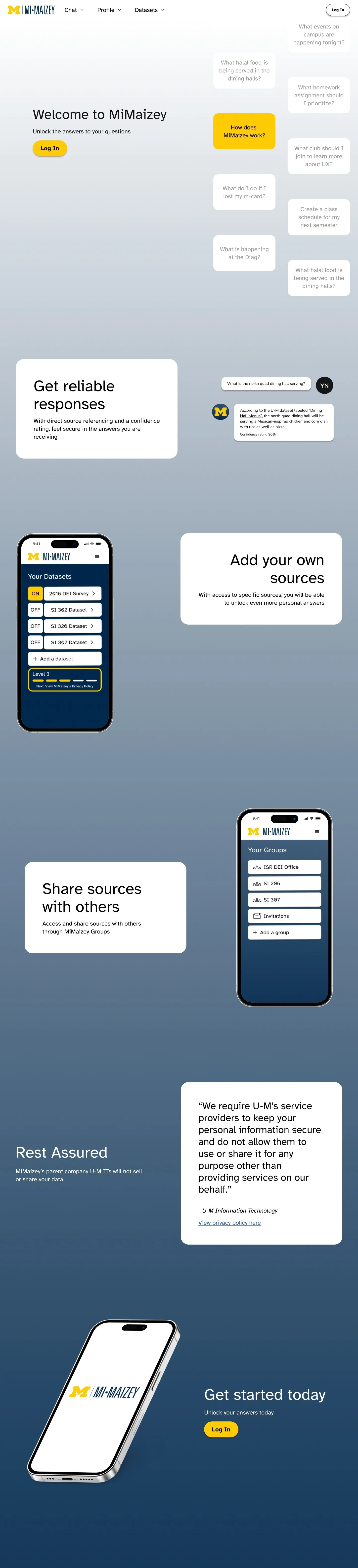
iPhone 14 View

Reflection
This was my first project that I did as a User Experience Design major. That being said, there was a major mistake I made during the design process. You've probably heard the phrase, 'You are not the user,' right? It's a popular saying in design circles, (and is often attributed to Don Norman), especially in UX design. It's all about reminding us not to rely too much on our assumptions when we're creating something. Instead, we need to really get to know our target audience and understand their needs and viewpoints. In this project, I was someone who would be considered a target user, however, knowing this rule, I should have interviewed at least 4 other people, and if time allowed for it, 11 more.