Ondo Bakery
Overview: This case study is an individual project that focuses on the redesign of Ondo Bakery’s website. Through this redesign, I aim to increase the accessibility and usability of this website.
Role: UX/UI Designer, UX Researcher
Duration: 4 weeks
Toolkit: Figma, FigJam, Pen & Paper
Discovery
In this first phase, I wanted to familiarize myself with Ondo Bakery, both from the customer’s and business owner’s experience. In order to do this, I conducted observation in context, heuristic evaluation, stakeholder interviews, and competitive analysis.
Key Insights
User Goal
The goal of users varies from person to person, but the majority of users are looking for somewhere to sit and enjoy their pastries/beverage.
Accessibility Issues
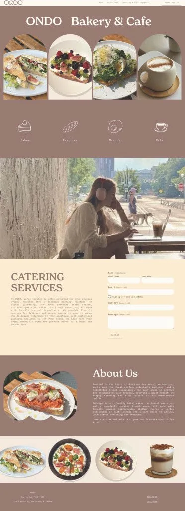
The current website lacks accessible color contrast and contains instances of text over images.
Frustration
Frustrations that users ran into was figuring out how to obtain their baked goods.
Usability Issues
The website lacked user control, consistency and standards, recognition rather than recall, flexibility and efficiency of use, and minimalist design.
Define
Problem Statement
Ondo Bakery customers want an easy way to enjoy their pastries and beverages, but they face confusion in store while obtaining baked goods, as well as difficulty navigating the website. The current site lacks accessibility, user control, consistency, and clear design, making it hard for users to find information and complete tasks efficiently.
Persona
Derek is a 19-year-old university student who visits Ondo Bakery to relax, socialize, and get work done while enjoying pastries and beverages. He tries to use the website to view the menu and place orders, but finds it difficult to navigate due to poor accessibility and inconsistent design. While he loves the bakery’s atmosphere and offerings, he wishes both the in-store and online experiences were easier and more user-friendly.
Product Vision Board
In order to increase profit, Ondo Bakery needs to have an efficient website that allows for an easy ecommerce experience that hosts all products.
Low Fidelity Ideations
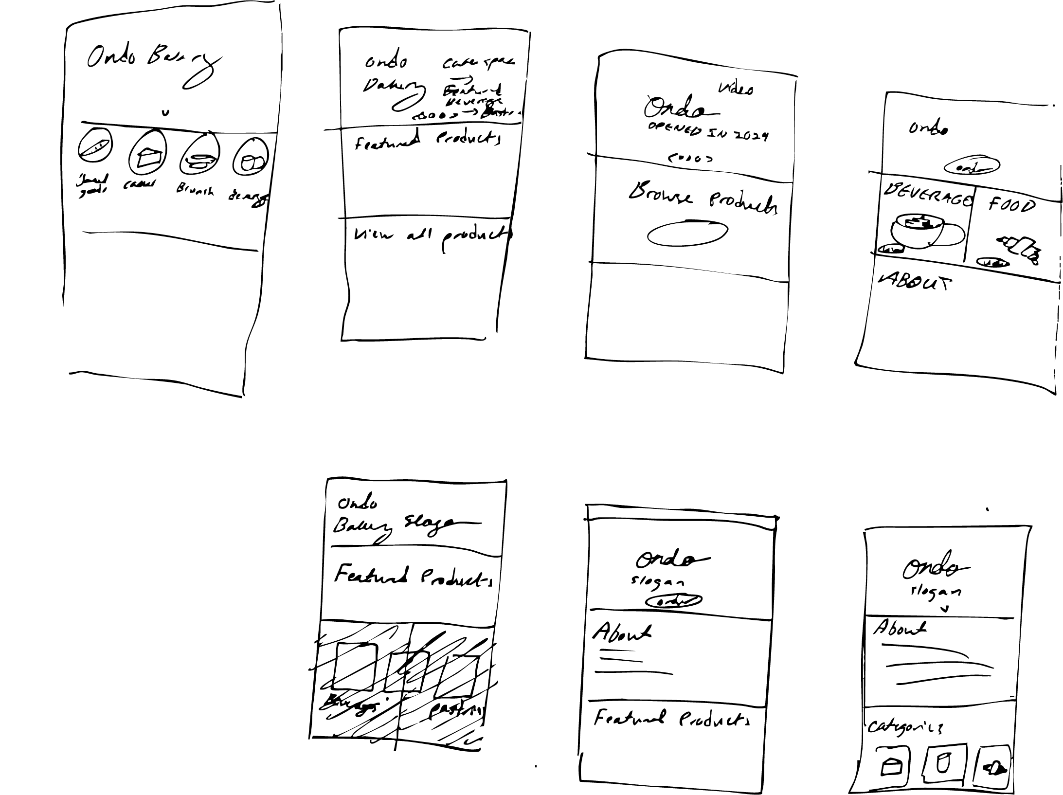
Crazy 8 Sketches
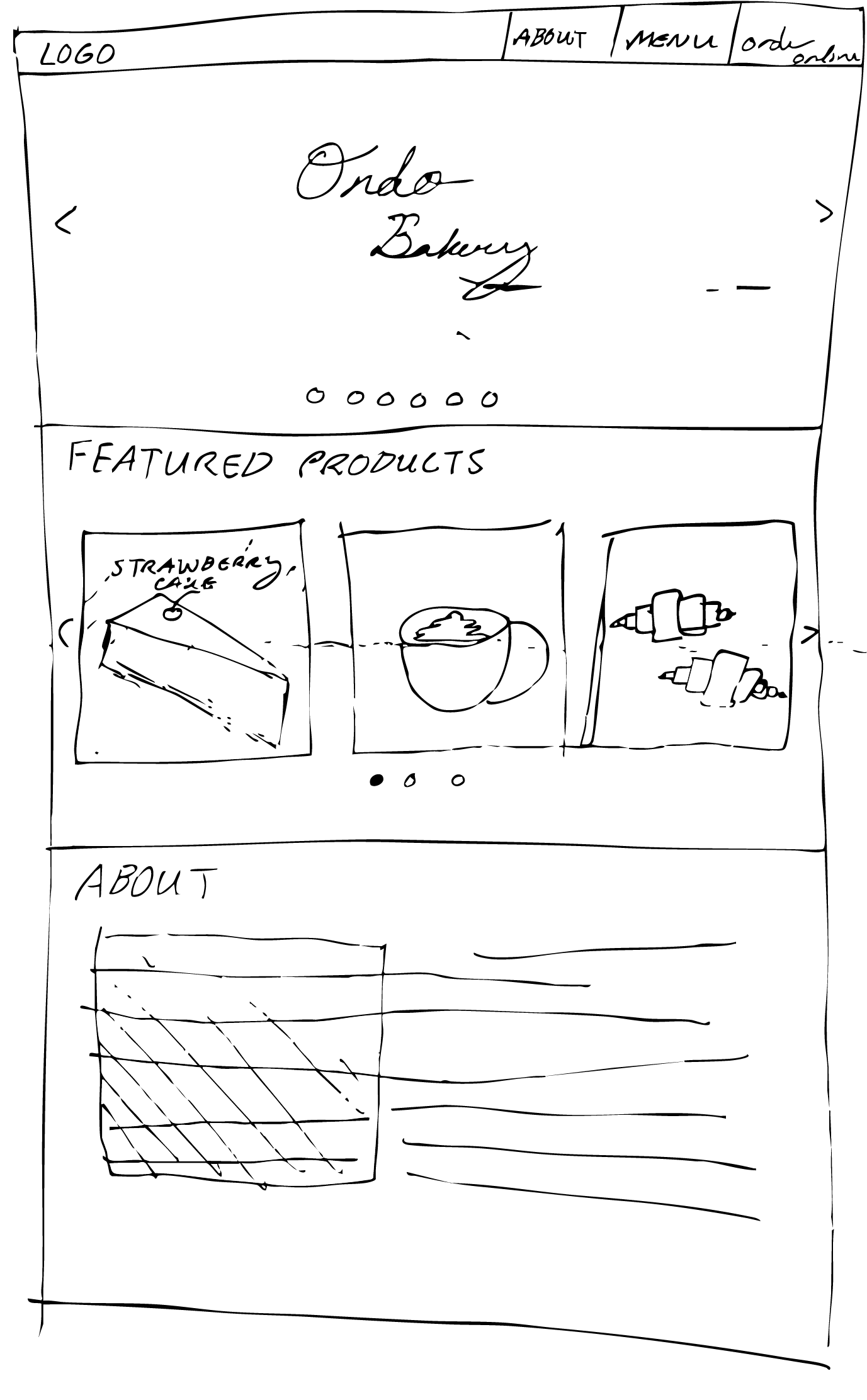
Solution Sketch
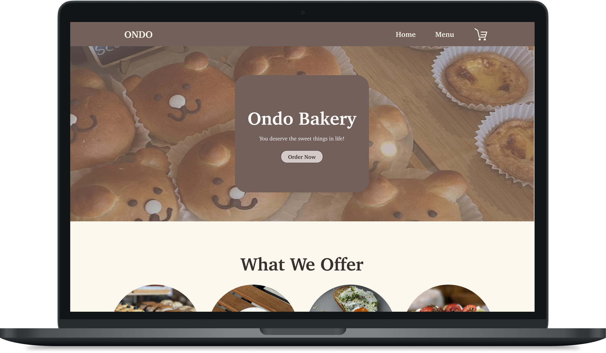
Initial Prototype
Design Decisions
I added a video showing users how to get their pastries in store, a pain point noted in my discovery
I implemented a breadcrumb navigation for the desktop version of the site and a back button for the mobile, effectively giving users more control over their experience
I kept the purchasing process on the same site to increase efficiency
I added images to the combined menu and order page for easier recall of items
To address accessibility issues, I did not put text directly over images without an accessible overlay
Usability Testing
Using usertesting.com, I recruited 3 participants to test the usability of my prototype and the original design for a baseline
Testing Plan
For both the live website and the prototype, I had my participants go through this task script:
Find the strawberry croissant and add it to your tray
Now that you have added a strawberry croissant, add a matcha latte
Proceed to check out with both the strawberry croissant and the matcha latte in your tray
If you had a magic wand, how would you improve this site? [Written response]
What did you like about the site? [Written response]
What frustrated you most about this site? [Written response]
Was there anything that blocked you from achieving the end goal? [Written response]
Test Results
Live Website
Task 1:
Average Time Taken: 1:56 minutes
Task 2:
Average Time Taken: 00:37 seconds
Task 3:
Average Time Taken: 00:14 seconds
Prototype
Task 1:
Average Time Taken: 55 seconds
Task 2:
Average Time Taken: 00:17 seconds
Task 3
Average Time Taken: 00:20 seconds
Affinity Mapping
After conducting the tests, I further analyzed the interactions participants had with my prototype by conducted qualitative analysis. I categorized the actions and quotes of participants in order to better understand what users found enjoyable or disliked.
I discovered:
Users wanted to see signaling for when items were added to cart
Users were hesitant about pressing CTA button on homepage
Users were confused with the language of the buttons on the nav bar
Final Prototype
Changes I made in this final iteration were:
Increasing the color contrast to better meet the Web Content Accessibility Guidelines (WCAG).
Adding visual cues when items are added to the cart, effectively increasing the visibility of the website’s status
Changed the navigation “Tray” to a cart icon — matching other websites — for better ease of use
Removed the “menu” button next to the “order now” button to reduce user confusion.
Design Comparison
Conclusion
Working on a project with just under a month to deliver the final outcome was a dramatic shift from the timelines I’d previously experienced. This accelerated schedule required me to quickly adapt my workflow and mindset to keep up with the demands. One of the most valuable lessons I learned was how to conduct research efficiently; instead of lengthy, in-depth studies, I explored rapid and cost-effective research methods. These approaches enabled me to gather actionable insights without significant delays or expenses.
The tight timeline also pushed me to become more comfortable with rapid prototyping and fast design iteration. I realized the importance of letting go of perfectionism and focusing on producing workable designs that could be tested and improved upon in each cycle. This process of quickly sketching, prototyping, gathering feedback, and revising allowed me to see tangible progress within days rather than weeks.


